Role | UI/UX designer Timeline | 2023 - 2024 Tools | Figma, Illustrator Team | Mike Tsay, Jennifer Wang, Colby Carter, Alen Khoduzadeh
TrailSport is Honda’s off-road lineup, built for rugged performance and immersive adventure driving. To support Honda’s vision for software-defined vehicles, the in-car experience for the next TrailSport lineup was refreshed. As the lead UI/UX designer, I coordinated cross-functional meetings to align updates and was primarily responsible for designing the meter screen.
22-30% of Honda users do off-road riding with their current Honda vehicle
Honda Customer Survay, 2024
80% of the surveyed group drive other makes/models off-road.
Honda Customer Survay, 2024
Distracted driving contributed to ~29% of road deaths in 2022
NHTSA, 2022
Pain points
High Information Density
Lack of Visual Hierarchy
Unengaging data visualization
Needs update for new brand direction
A design challenge emerged....
How can we design an infotainment system that intuitively delivers essential trail information in an engaging way, while embodying Honda’s new brand vision?
This question guided our focus on creating an intuitive and seamless user experience that reduces cognitive load and visually aligns with Honda’s new vision, aiming to deliver both functional and emotionally engaging experiences for outdoor enthusiasts.
User Goals
Goal 01 Simplify the interface to make it more intuitive
Goal 02 Establish a clear visual hierarchy for easier focus
Goal 03 Make data visualizations more engaging
Goal 04 Update visual design to match the new brand vision
The Solution
The new Trail Infotainment System is an intuitive, adaptive HMI designed specifically for off-road and adventure drivers. It addresses key pain points from the previous interface, such as information overload, lack of visual hierarchy, unengaging data visualization, and outdated, inconsistent design, by simplifying the interface for greater intuitiveness and establishing a clear visual hierarchy. The system prioritizes essential trail information to reduce cognitive load and dynamically adjusts to driving conditions to support a diverse range of users. With engaging data visualizations and a rugged yet refined design aligned with Honda’s refreshed adventurous brand identity, the Trail Infotainment System strives to deliver a safer, smarter, and more enjoyable off-road experience while maintaining a unique TrailSport spirit.
Key Features
Key Takeaway
• Learned to integrate a distinct sub-brand into a unified platform, preserving TrailSport’s rugged identity while aligning with Honda’s carbon-zero, software-defined vision. • Strengthened cross-functional communication through recurring alignment meetings with global teams, ensuring clarity across design, engineering, and business.
Process
The product development process was highly iterative and collaborative, shaped by ongoing feedback and insights from multiple global studios. As lead UI/UX designer at the LA R&D studio, I led concept development, UI/UX design, and prototyping while coordinating regular cross-functional meetings with researchers, engineers, motion designers, and leadership to ensure clear communication and alignment throughout development. Research and user testing provided by the engineering team in Ohio played a key role in identifying real-world usability challenges and prioritizing critical information for off-road driving. The design process operated within strict constraints, including reserved screen zones (“red lines”), fixed screen dimensions, and adherence to Google’s Android Automotive guidelines, requiring thoughtful UI strategies to balance clarity, functionality, and safety. Additionally, the interface needed to support Honda’s global carbon-zero rebranding initiative, reflecting a cohesive visual language across the software platform while preserving TrailSport’s distinct adventurous and off-road identity.
Previous Design
01 Improve Point – Clarity of Information The screen provides a wide range of data, but prioritizing key information by context would make it easier for drivers to focus on what matters most.
02 Improve Point – Visual Hierarchy All elements currently carry a similar visual weight, which can cause important information to be less noticeable. Strengthening the visual hierarchy would help highlight key data at a glance.
03 Improve Point – Data Visualization Engagement The data is well presented, but it could feel more meaningful and engaging with interactive or contextual visualizations. Enhancing this would increase usability and user connection.
04 Improve Point – Brand Alignment The current design is functional, but aligning it more closely with Honda’s refreshed global brand identity would create a more consistent, modern, and cohesive brand experience.
The pre-existing Trail Infotainment design established a strong foundation by delivering a wide range of useful data. Building on this, there is an opportunity to reduce information overload and make essential details easier to access during off-road driving. The layout can be further refined with a clearer visual hierarchy, while data visualizations could be made more engaging and context-rich to support driver focus. Visually, aligning the interface more closely with Honda’s modern, lightweight, and software-driven brand direction will strengthen both usability and brand consistency. Above all, a new design was needed to reflect the key points of Honda’s rebranding — thin, light, and smart.
Magic Moments
01 Wouldn’t it be nice if the screen could sense the surroundings and show only the minimum information needed, so the driver can stay focused on the trail?
02 Wouldn’t it be nice if the system adapted to the driver’s personal preferences, tailoring what’s displayed and how it’s shown just the way the driver likes it?
04 Wouldn’t it be nice if the system were aware of the driver’s off-roading skill level and adjusted the content and layout accordingly, so the driver receives exactly what’s needed without overload?
03 Wouldn’t it be great if the system’s design evolved automatically as Honda’s global brand identity updates, keeping the experience fresh, consistent, and always on-brand for the driver?
User Goals
01 Simplify information display Present only the most essential data at any given moment to reduce cognitive load and improve quick comprehension.
02 Strengthen visual hierarchy Organize information by importance using size, color, and placement to guide the driver’s focus effectively.
03 Enhance data visualization Use engaging, meaningful visuals and animations to make data easier to interpret and more interactive.
04 Align with new brand identity Adopt a modern, lightweight, and software-driven look that reflects Honda’s refreshed global identity.
The new Trail Infotainment System was redesigned with four main goals. First, we simplified the display to show only the most important data during off-road driving. Second, we created a clearer visual hierarchy using size, color, and layout to guide driver attention. Third, we improved data visualization with more dynamic and context-rich graphics. Finally, we refreshed the look to reflect Honda’s rebranding: thin, light, and wise, building trust and a modern, consistent design language.
Research & Concept Development
The Trail Infotainment System concept was developed through multi-source research and collaborative design efforts to ensure the solution was both user-centered and market-aware. In-depth research was initially provided by the Ohio team’s customer surveys, expert interviews, and competitor benchmarking. Building on this foundation, our R&D team in LA conducted additional research and analysis to refine the concept, define the design direction, and apply the data effectively within the interface.
Customer Survey Helped identify the types of trail information users want to feel more confident and in control during off-road driving.
Expert Interviews Provided guidance on which technical features and real-time vehicle data are essential for safe and effective off-road experiences.
Competitor Benchmarking Revealed that Honda’s current infotainment offering lagged behind key competitors, many of whom already provide advanced features.
22-30% of Honda users do off-road riding with their current Honda vehicle
Honda Customer Survay, 2024
22-30% of Honda users do off-road riding with their current Honda vehicle
Honda Customer Survay, 2024
80% of the surveyed group drive other makes/models off-road.
Honda Customer Survay, 2024
Distracted driving contributed to ~29% of road deaths in 2022
Up to 25% improvement in driver decision making speed with visually prioritized interfaces
Human Factors and Ergonomics Society, 2022
Global off-road vehicle market valued at $23.29 billion in 2023, projected to reach $39.5 billion by 2033
Allied Market Research, 2023
Off-road vehicle electronics market expected to grow from $12.5B in 2023 to $22.3B by 2032 (CAGR 6.5%)
DataIntelo Market Report, 2023
Target Market
Demographic • Age Range: 25–54 years old • Gender: All genders, but majority male-skewed (based on off-road and truck ownership trends) • Occupation: Professionals, creatives, engineers, tech-savvy workers, and outdoor enthusiasts • Income Level: Middle to upper-middle class ($75k–$150k household income) • Location: Suburban to rural areas with access to trails, mountains, or national parks • Vehicle Use Case: Daily driving plus weekend off-roading, camping, or overlanding adventures • Driving Experience: Mix of novice to intermediate off-roaders seeking confidence and support • Lifestyle: Active, outdoor-oriented, and tech-friendly individuals • Tech Familiarity: Comfortable with in-car tech but prefers clean, intuitive, and easy-to-use interfaces • Device Usage: Regular users of navigation, fitness, weather, and off-road/trail planning apps
57% of SUV buyers are male, 43% are female.
Motor & Wheels SUV Demographics, 2023
43% of new SUV buyers are aged 25–54.
Motor & Wheels SUV Demographics, 2023
40% of SUV buyers have household incomes of $100K or more.
Inkwood Research, U.S. SUV Market Report, 2024
53% of SUV buyers hold a bachelor’s degree or higher.
Motor & Wheels SUV Demographics, 2023
Persona
Design Criteria
Mission Statement
Honda Trail Infotainment is an adaptive, user-centered interface crafted to deliver clear, prioritized trail information for off-road drivers. By intelligently tailoring content to diverse user needs and changing environments, it reduces cognitive load, enhances safety, and reflects the rugged, adventurous spirit of the Honda TrailSport brand.
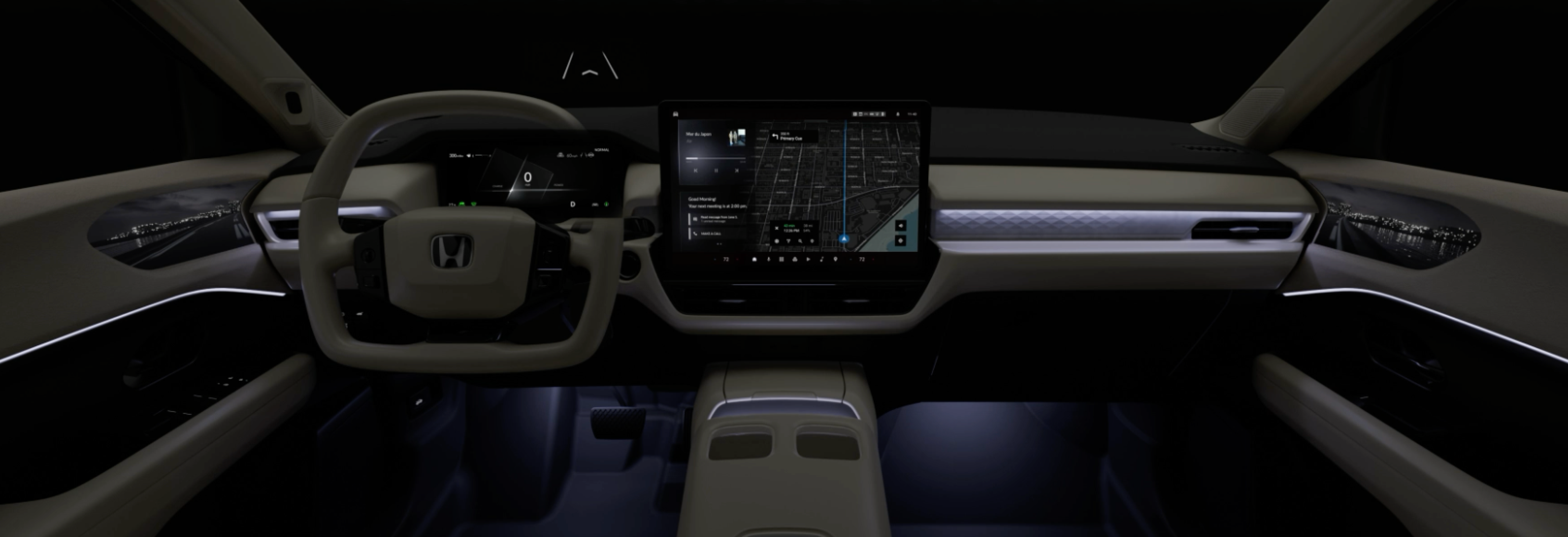
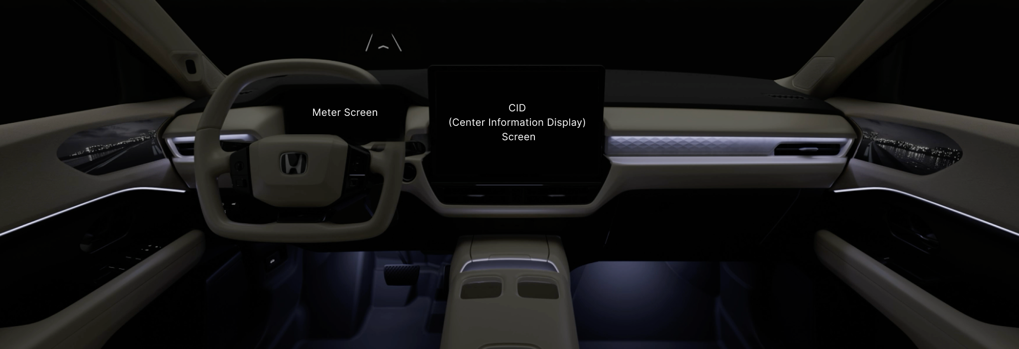
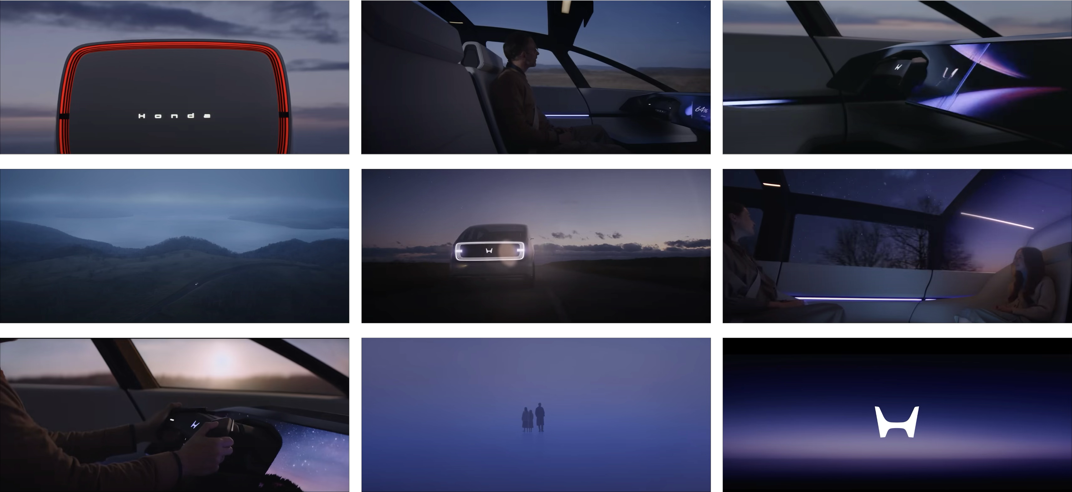
Reference : Interior
The interior featured two main screens: the meter and the CID (Central Information Display). For this Honda Trail infotainment System project, I led the design of the meter, located directly in front of the steering wheel. Once its concept was established, the CID design followed to maintain a consistent visual language and UX behavior. Development across both screens was closely coordinated, with teams working in parallel. Screen size, concept, lighting, and color continued to evolve throughout the process. Rather than progressing linearly, development advanced simultaneously to ensure alignment and cohesion.
Honda’s New Direction: Thin, Light, and Wise
Honda’s new tagline, “Go back to the starting point and redefine mobility from 0,” reflects a fresh approach based on three ideas: Thin, Light, and Wise. Thin means designing vehicles with a low, aerodynamic shape. Light focuses on sporty driving and energy efficiency. Wise uses smart software and technology to improve the driving experience.The Trail Infotainment System follows this approach by providing a simpler, more intuitive interface. Design choices were made to make information clear and interactions easy, helping drivers stay focused and connected to the car.
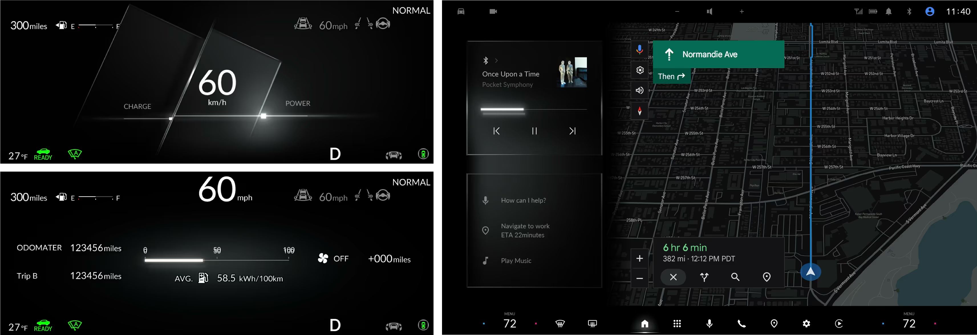
Reference: CID Screen Design
Guide Words
Wireframe: Option 1 & 2
Take 01 - Option 1 & 2
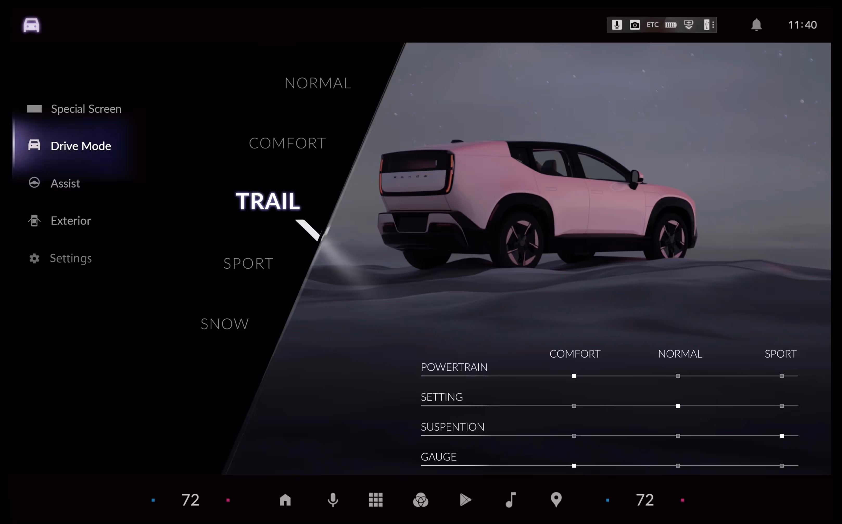
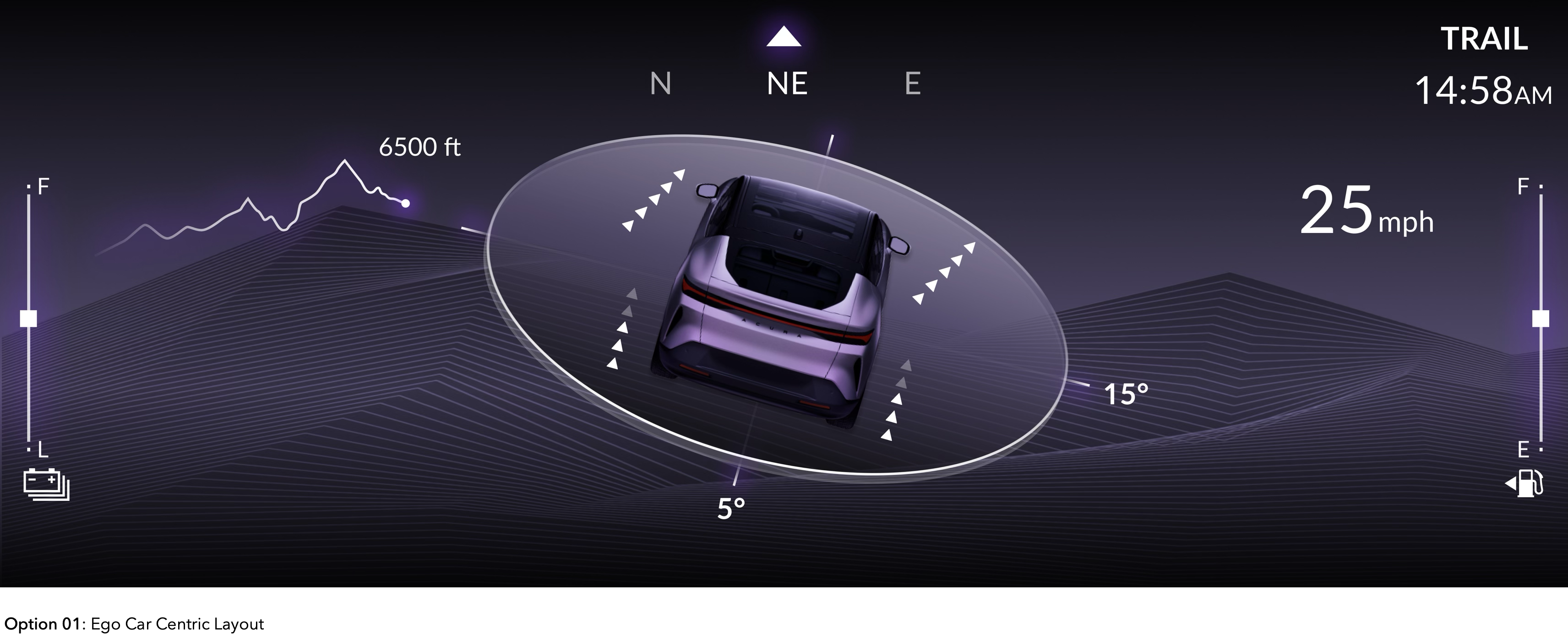
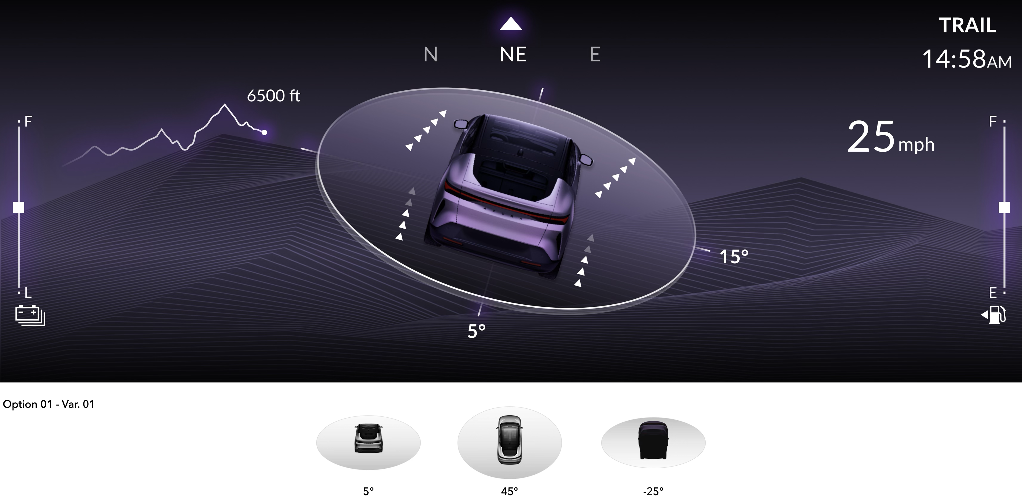
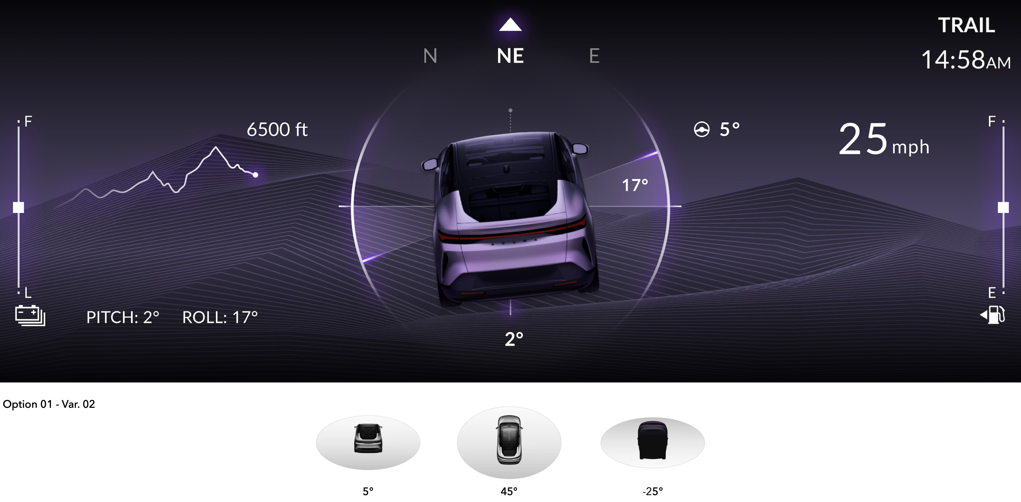
Between Option 1 and Option 2, Option 1 was chosen for its intuitive and easy-to-understand design. This ego car-centric layout features a main 3D vehicle display that dynamically reflects real-time pitch and roll. A purple hue was predominantly used, as it is the primary brand color of Honda’s 0 Series vision, which serves as the umbrella for Honda’s new direction. Building on this foundation, we developed additional variations, embedding visual cues that evoke the three pillars of the brand: Thin, Light, and Wise.
Take 02 : Option 1 - Varations
As the initial approach, we chose the one-person perspective for the 3D vehicle graphic to represent pitch and roll because it felt intuitive and more engaging for the driver. However, this perspective presented a design challenge: when the front of the car pitched forward, the visual could awkwardly reveal the underside of the vehicle. This led us to explore additional options and conduct further research on competitors’ implementations to inform our next steps.
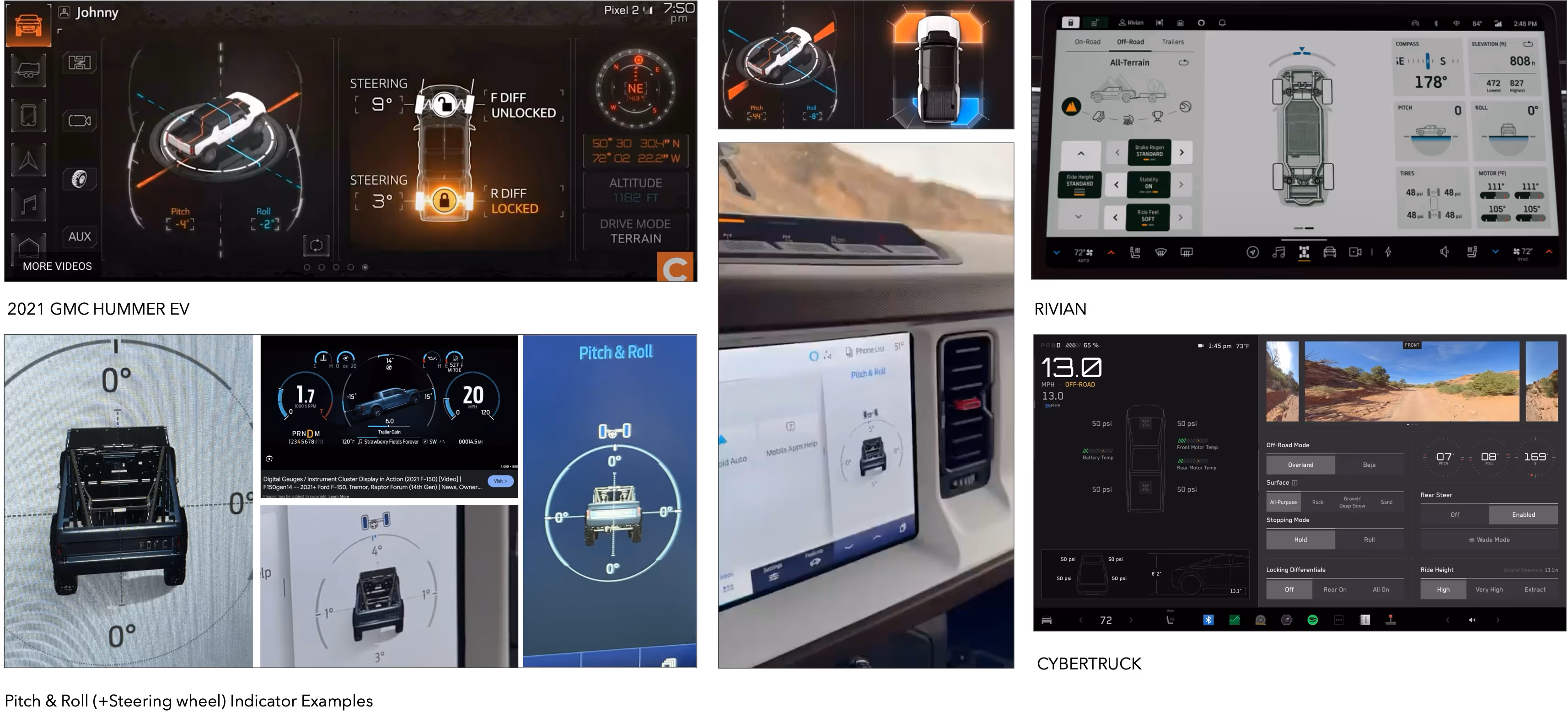
Competitor Research
After studying how competitors display pitch and roll on their HMI screens, we found that the 2021 GMC Hummer EV uses an isometric view, which proved effective. As part of our process, we decided to test the isometric view in our own design to evaluate its effectiveness.
Take 03
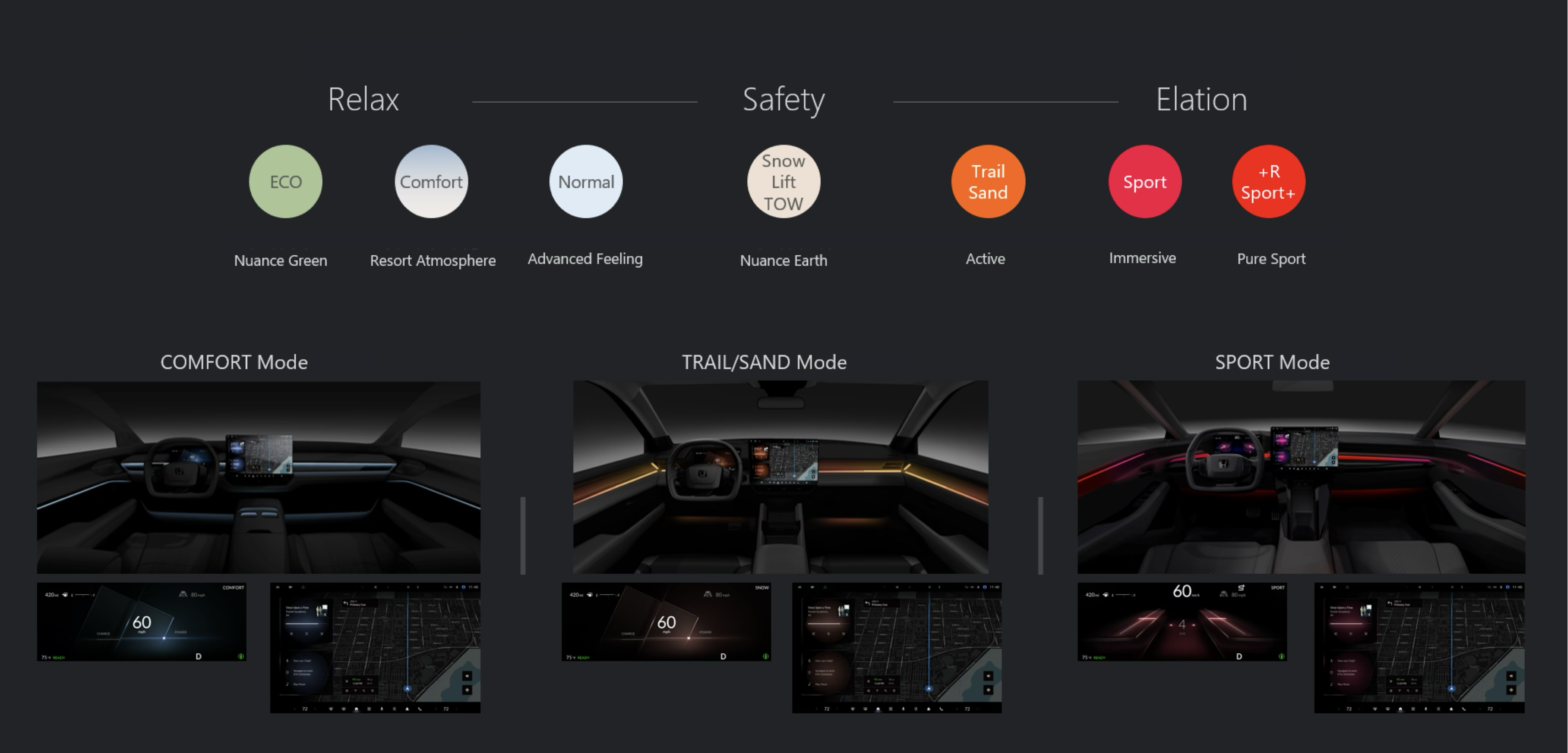
Reference: Lighting Color
Meanwhile, the studio in Japan was exploring how to connect unique interior lighting with each driving mode. For Trail mode, they chose a tan/orange hue and asked us to create a prototype of the Trail Infotainment System using a matching tan color to test the integration. In response, we began exploring design concepts centered around this tan hue to align with the interior lighting for Trail mode.
Take 04 + Motion Studies
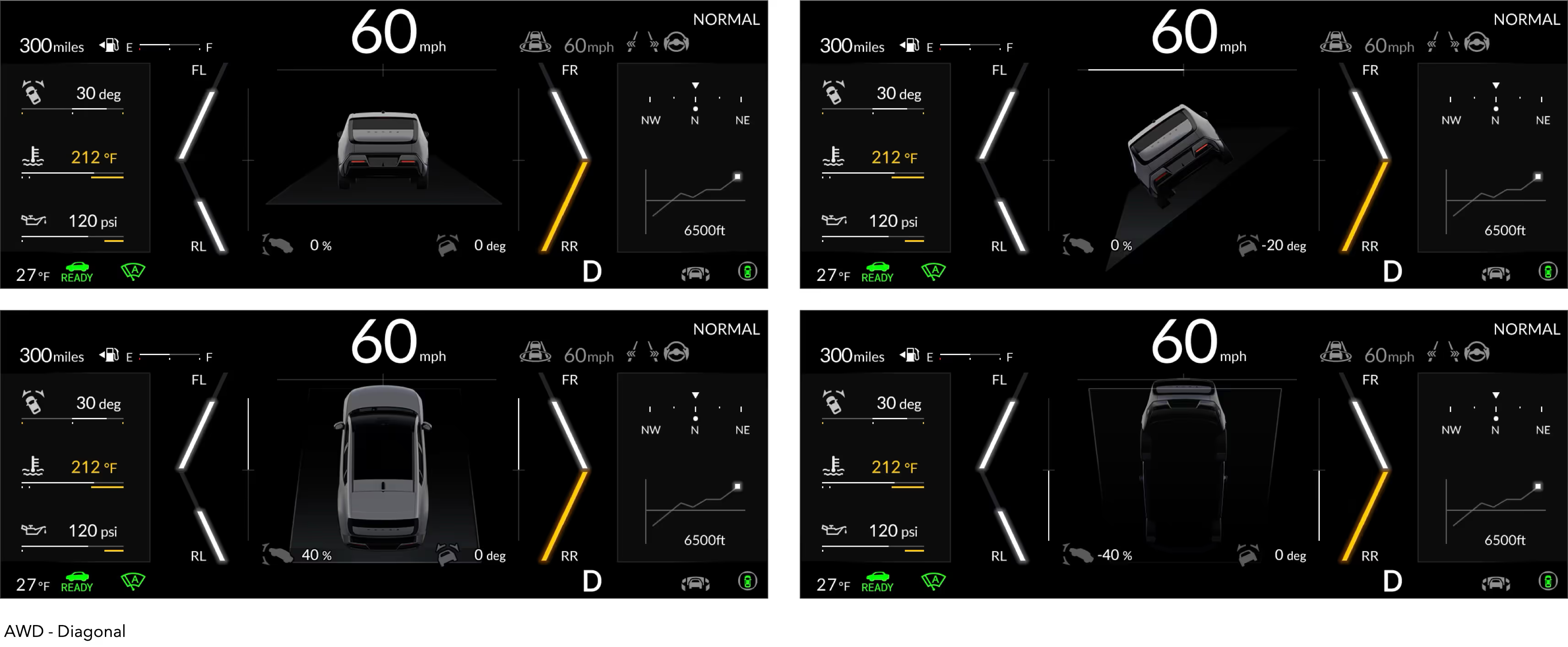
We tested the motion, hue, and opacity of the pitch and roll guide lines to ensure they clearly display live data without distracting the driver. Since off-roading constantly updates pitch and roll values, it was important to keep the visualization informative but not overwhelming.
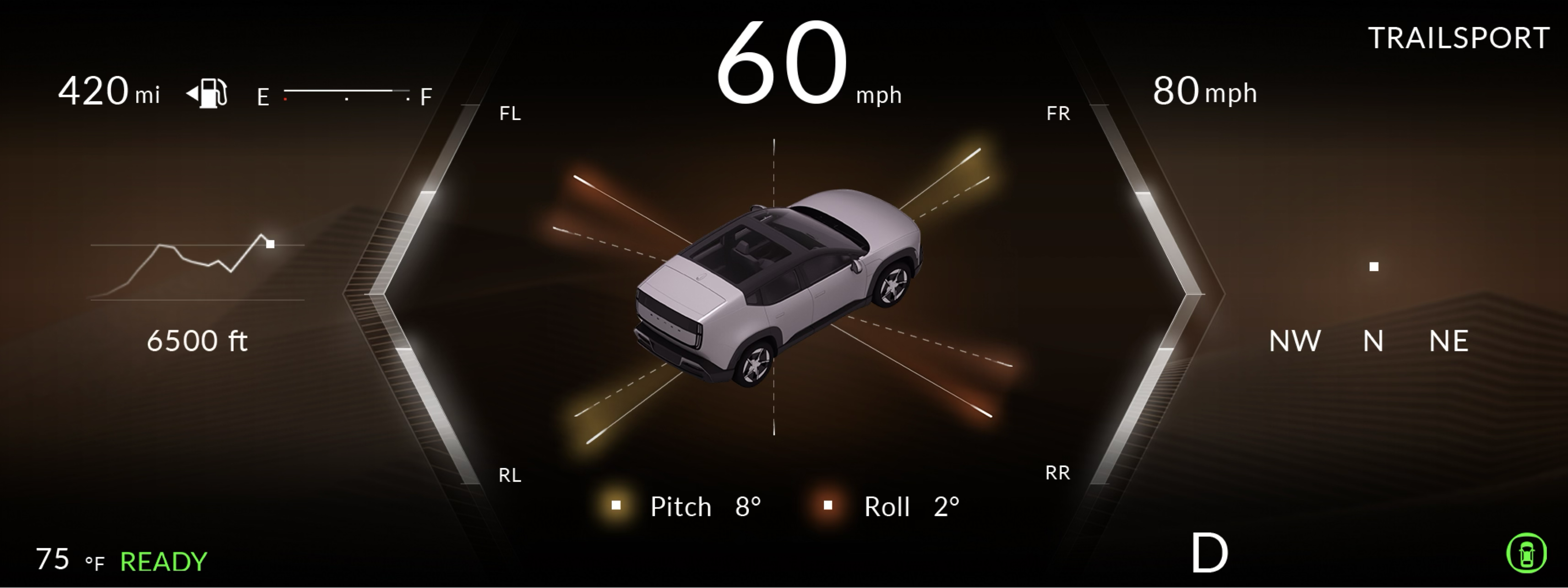
Take 05 : Updated
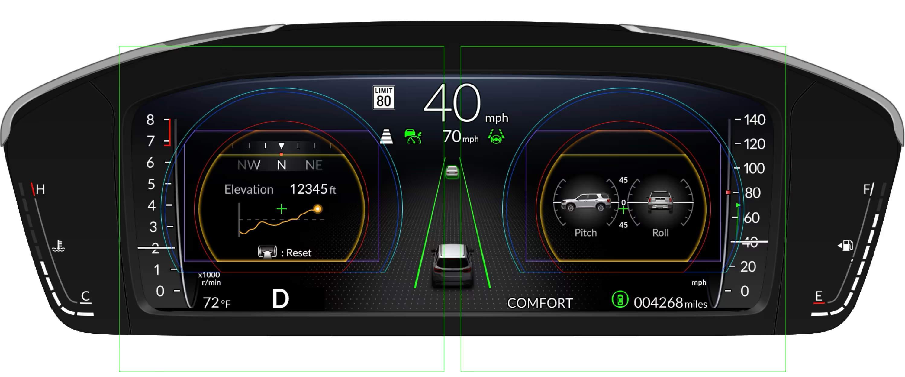
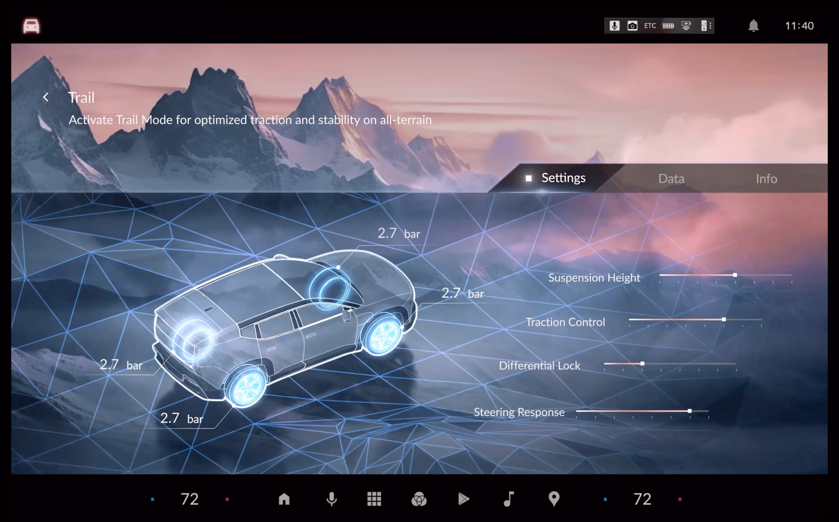
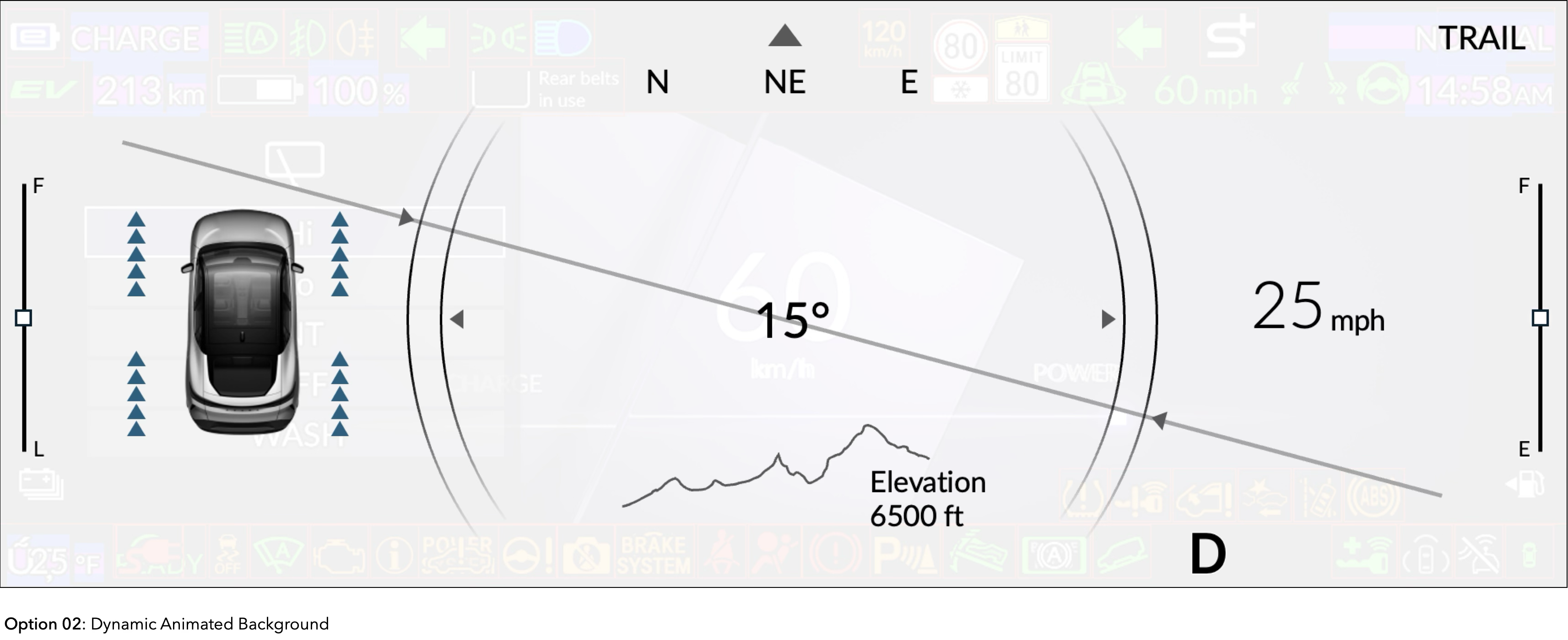
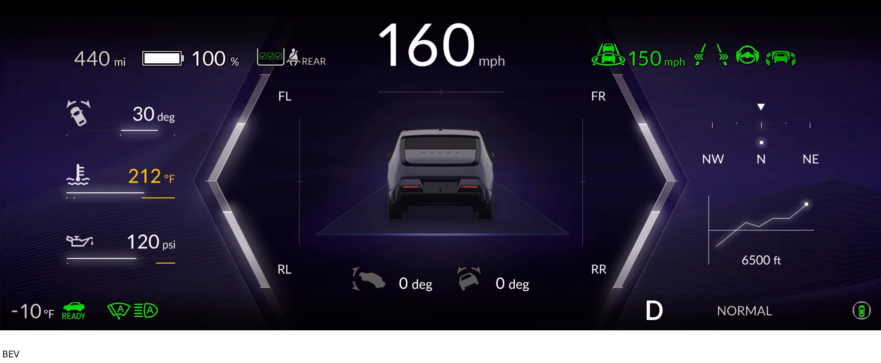
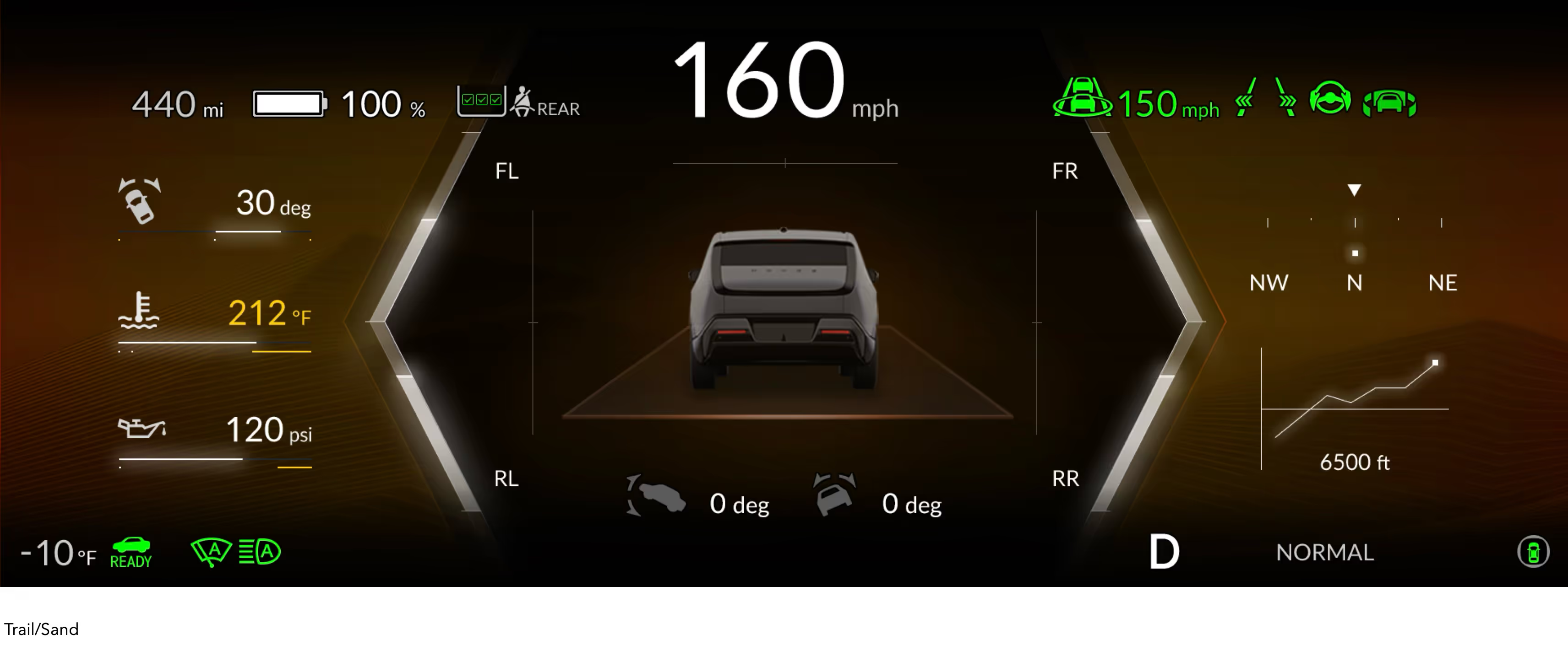
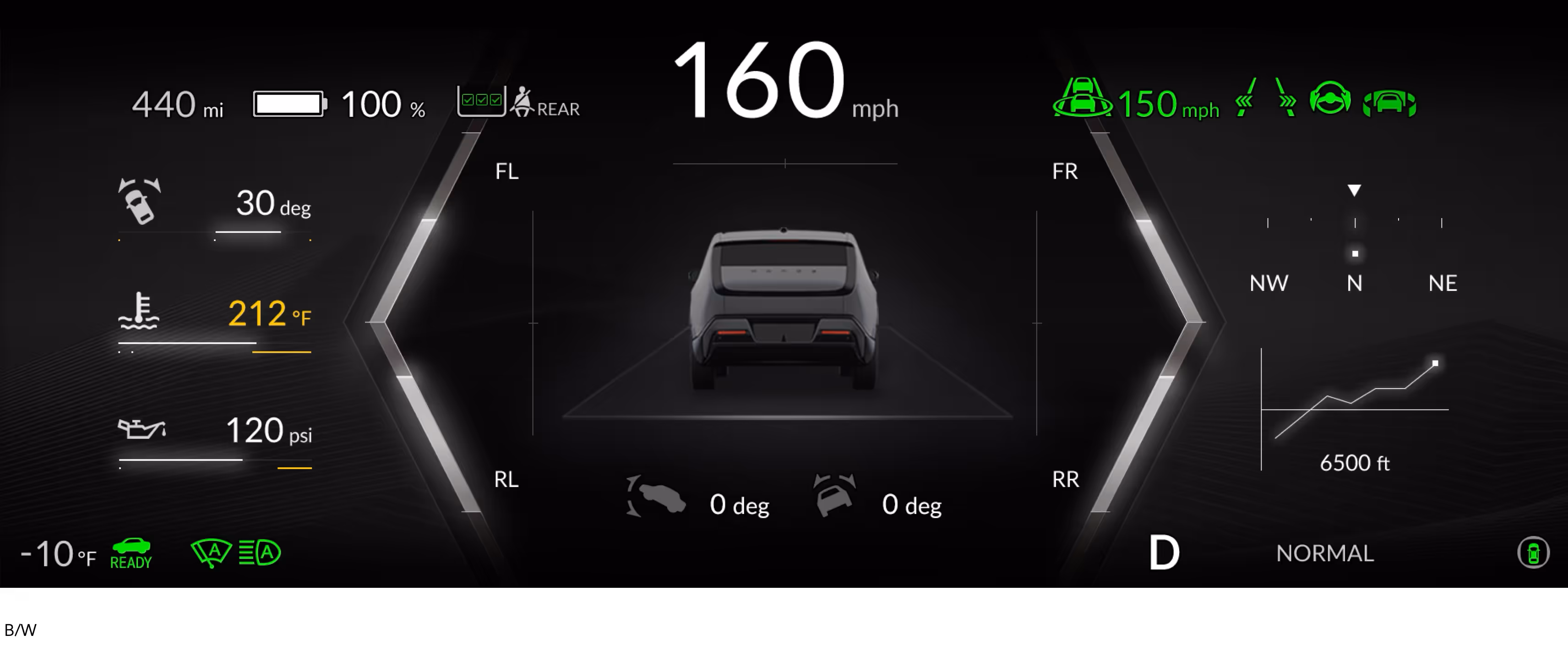
For this update, I added a diagonal AWD (All-Wheel Drive) torque graphic to show how torque is distributed between the front and rear wheels. This helps drivers understand real-time torque changes during off-road driving
AWD Torque Graphic Test
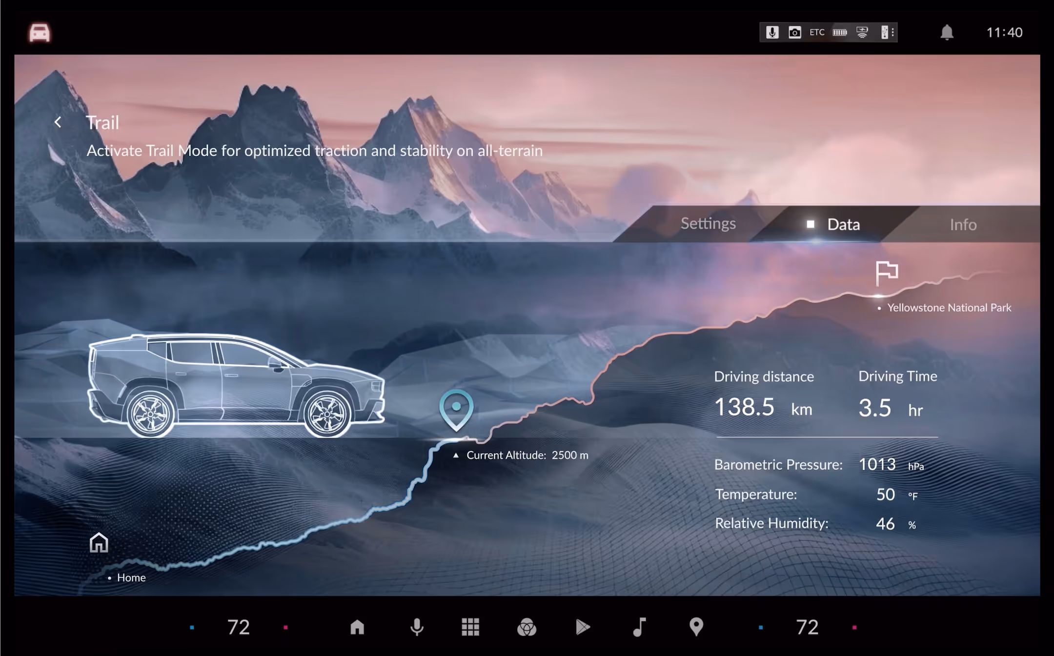
There was concern that drivers might not readily recognize the diagonal shape as representing front and rear torque distribution, since the slanted orientation is uncommon. The studio in Japan requested that we try a vertical orientation for the torque graphic to see if it would be more intuitive. After conducting user testing, the team in Ohio provided feedback requesting a clear display of key information on both sides of the screen, including steering angle, oil temperature, oil pressure, heading, and elevation. The previous images show the wireframes they shared to facilitate communication.
Hue Study
The meter design for Honda’s 0 Series evolved alongside the vehicle lineup. Initially, a purple hue was used to represent the EV models, reinforcing the brand’s electric identity. To align with the interior-mode concept, a tan/orange hue was introduced, assigning distinct colors to each driving mode for better driver recognition and a cohesive experience. As the lineup transitioned toward hybrid models, the meter design shifted to a black-and-white palette to clearly differentiate these vehicles from the fully electric ones.


.png)